



Week 1
Immersion & Diagnosis
Interviews with the people who run the business, competitor analysis, listening to your audience and reading everything the brand already publishes. Delivered: diagnosis and brand territory.
 Branding & Identity
We are a studio for branding and visual identity design. We build whole brands — strategy, name, symbol, colors, typography and tone of voice — gathered into clear guidelines, so everything your company publishes looks like it came from the same place.
More than 150 brands built — from the local clinic to the company that exports
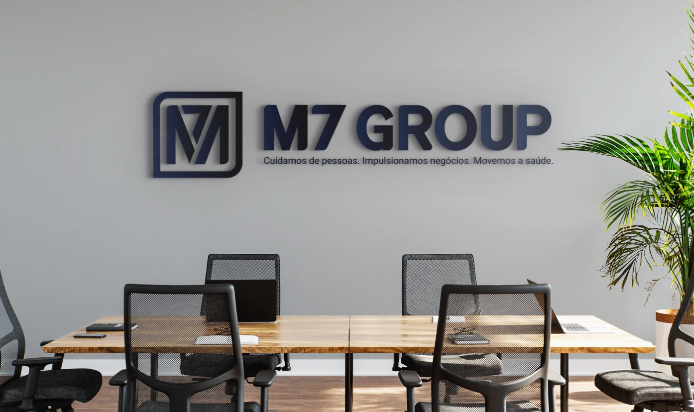
A brand is not what you say it is. It is what stays in the mind of whoever saw it — and that is built on purpose.
Week 1
Interviews with the people who run the business, competitor analysis, listening to your audience and reading everything the brand already publishes. Delivered: diagnosis and brand territory.
Weeks 2–3
We define purpose, positioning, personality and tone of voice — and, when the project calls for it, the name. From that comes the creative concept that guides the whole visual system. Delivered: brand platform.
Weeks 4–5
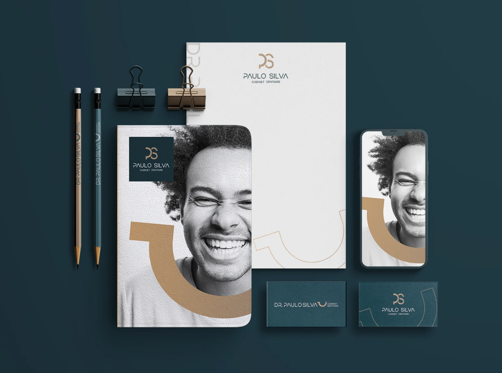
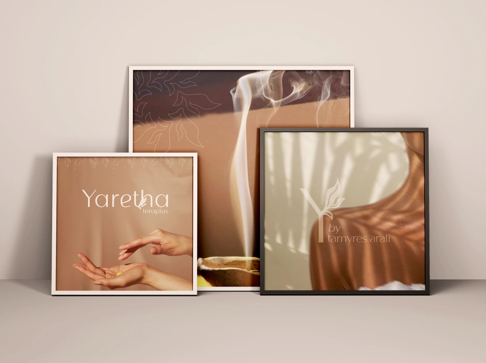
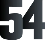
Symbol, typography, color palette, graphic elements and the first real applications. You see the brand alive before approving it — on stationery, social media and packaging. Delivered: approved identity.
Week 6
We gather everything into clear guidelines, with rules of use, versions and examples of what to do and what to avoid. Delivered: brandbook, source files and social media kit.
 What we create
Not every business needs to start from scratch. Before we draw a single symbol, we decide how far the project goes — and the quote follows that choice.
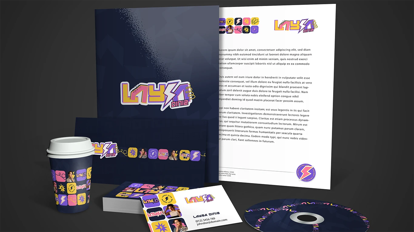
From symbol to guidelines: logo and its variations, palette, typography, graphic elements and applications ready to use the next day.
The way the brand speaks: name, tagline, tone of voice and the words it uses — and the ones it never uses — on every channel.
For brands that grew bigger than their own image. We keep what already carries value and rebuild the rest.
Included
No basic package, no “that costs extra”. Everything below goes into every identity project that leaves the studio.
Primary, reduced, monochrome, horizontal and vertical versions — with construction grid and clear space defined.
Colors in CMYK, RGB, HEX and Pantone, licensed fonts and the typographic hierarchy for every kind of piece.
Patterns, textures and supporting elements that make the brand recognizable even when the logo is nowhere in sight.
Tone of voice, brand vocabulary and written examples — the same way of speaking on the site, on Instagram and by email.
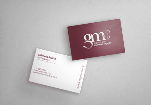
Business cards, email signature, presentation, uniform, signage, packaging — whatever your business actually uses.
Avatar, covers, frames and post templates in the new brand style, ready to publish.
A clear document, with rules of use and examples of what to do and what to avoid, for any supplier to follow.
Every editable file in your hands, plus thirty days of follow-up as the brand goes into use.
Results
The guidelines exist so the identity still stands on the day we are no longer in the room.
Other services
Bespoke websites, landing pages and online stores — fast and ready for Google.
Decks and reports that hold the room and explain your idea in minutes.
Planning, design and consistency for your brand’s digital presence.
Next step
Tell us in two lines what your company does and what the current brand is failing to say. We reply with a quick diagnosis and a proposal with a fixed timeline and price.
Chat on WhatsAppFAQBranding
It depends on the scope: a brand that only needs a logo, palette and guidelines is very different from a project with naming, packaging and repositioning. After the first conversation you receive a fixed proposal, with scope, timeline and price — no surprise costs halfway through.
The average is 6 weeks, from immersion to the finished guidelines. Projects that include naming or packaging can run to 8 or 10 weeks. The schedule is signed together with the proposal.
The logo is one piece. The visual identity is the whole system: the symbol and its variations, color palette, typography, graphic elements, photography and the rules that make them all speak to each other.
That is why a well-built brand is recognized even when the logo is nowhere in sight — by the color, the typography or the graphic pattern. Handing over only the logo is handing over one word and calling it a conversation.
Curious about the color part? Read how to choose brand colors. To see the three words side by side, read logo vs logotype vs visual identity.
The brandbook covers the construction of the logo, clear space, permitted and forbidden versions, the palette in CMYK/RGB/HEX/Pantone, typographic hierarchy, graphic elements, tone of voice and real application examples.
It exists so that anyone — your team, a printer, a social media manager, another agency — can apply the brand without distorting what was built.
We do. The naming process covers name territories, generating and filtering options, testing pronunciation and meaning, and checking domain and trademark availability before any decision. If the brand already has a name, we work on the tagline and tone of voice around it.
When the brand has stopped telling the truth about the business: you changed audience, raised your prices, widened your portfolio, merged companies, or simply are not taken seriously by the client you want to serve.
Rebranding is not erasing the past — we look at what already carries recognized value, keep that equity and rebuild the rest, with a transition plan so you do not lose the people who already know you.
L’Atelier 54 is a digital studio specializing in branding and visual identity design, and we have designed brands for very different markets:
We do. The whole process — immersion, presentations and delivery — happens remotely, with companies across Brazil and abroad.
We also create brands for businesses speaking to clients in Portugal, the United States and Europe, including versions of the identity in more than one language.
Still have something to ask?Talk to L’Atelier 54