M7 GROUP

Visual identity and web design · A healthcare solutions hub · Tatuapé, São Paulo2025

M7 Group is a healthcare solutions hub based in Tatuapé, São Paulo. It brings together six fronts that work as one: injectable medication, metabolic therapies, personalised medicine, specialised logistics, medical marketing and compliance and governance processes, all of them there to support doctors, clinics and companies across the sector.

L’Atelier 54 handled the visual identity and the web design and development, and takes care of the hosting: a brand able to hold six operations under one name, and a home of their own on the internet that explains what M7 is before the first meeting.

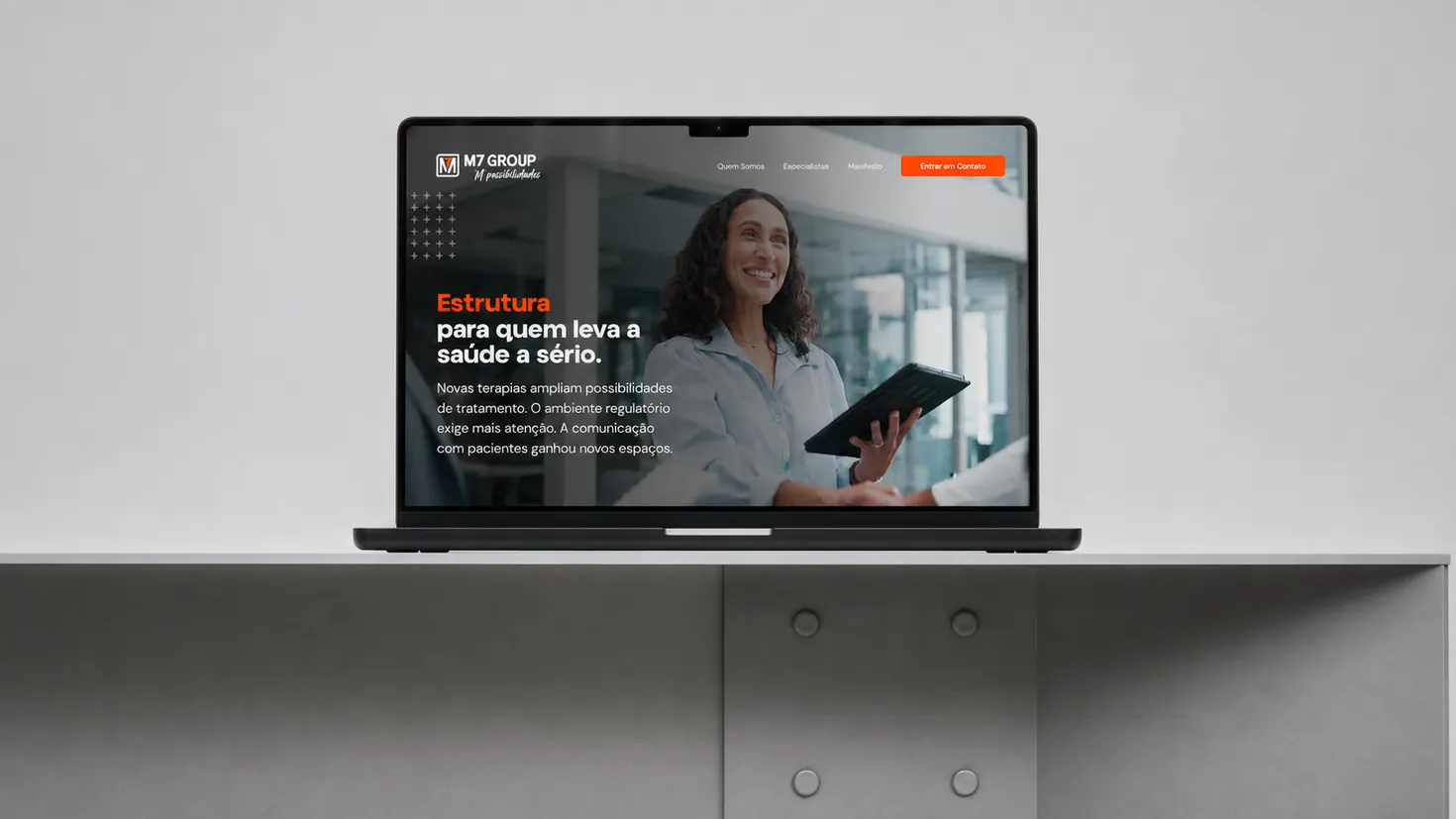
The M7 Group website open on a laptop, showing the home page headline

The visual identity

Visual identity for a healthcare company: one brand across six businesses

The pieces of the system, one by one, from the symbol on its own to the brand in everyday use.

Symbol

The icon

1/3

The “M” and the “7” share a single stroke inside a frame, and the frame says something too. The two rounded corners, on one diagonal, speak of a group flexible enough to shape itself around each doctor and each clinic; the two square corners, on the opposite diagonal, mark M7’s straight-ahead focus. On its own, the icon covers the social avatar, the favicon and applications in relief.

Full lockup

The logo

2/3

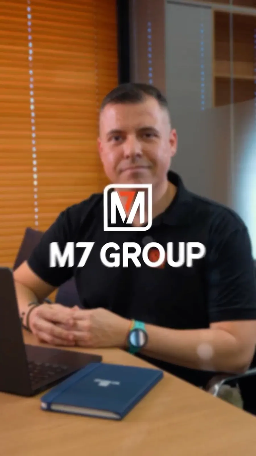
We drew the symbol and the wordmark as a single piece, with the signature “We care for people. We drive business. We move healthcare.” locked underneath. The delivery includes positive, negative and single-stroke versions, clear space and minimum size. That is what lets the brand arrive whole on the team’s uniform, on video, on the wall and on screen, with nobody having to improvise.

Application

Social media posts

3/3

We created the visual line for the posts and the first stretch of content: graphics, palette and a way of talking about regulation, compounding pharmacy and medical practice without sounding like a pharmacy leaflet. Today M7’s own team runs the day-to-day, on top of the system we left standing: the brand still reads in every post, long after the handover.

A visual identity for a healthcare group that does not sell a single product

Injectable medication, metabolic therapies, personalised medicine, logistics, medical marketing and governance are six businesses with different clients, timelines and languages. The brand had to be the thread holding all of them, strong enough to sign each front without turning into six loose brands.

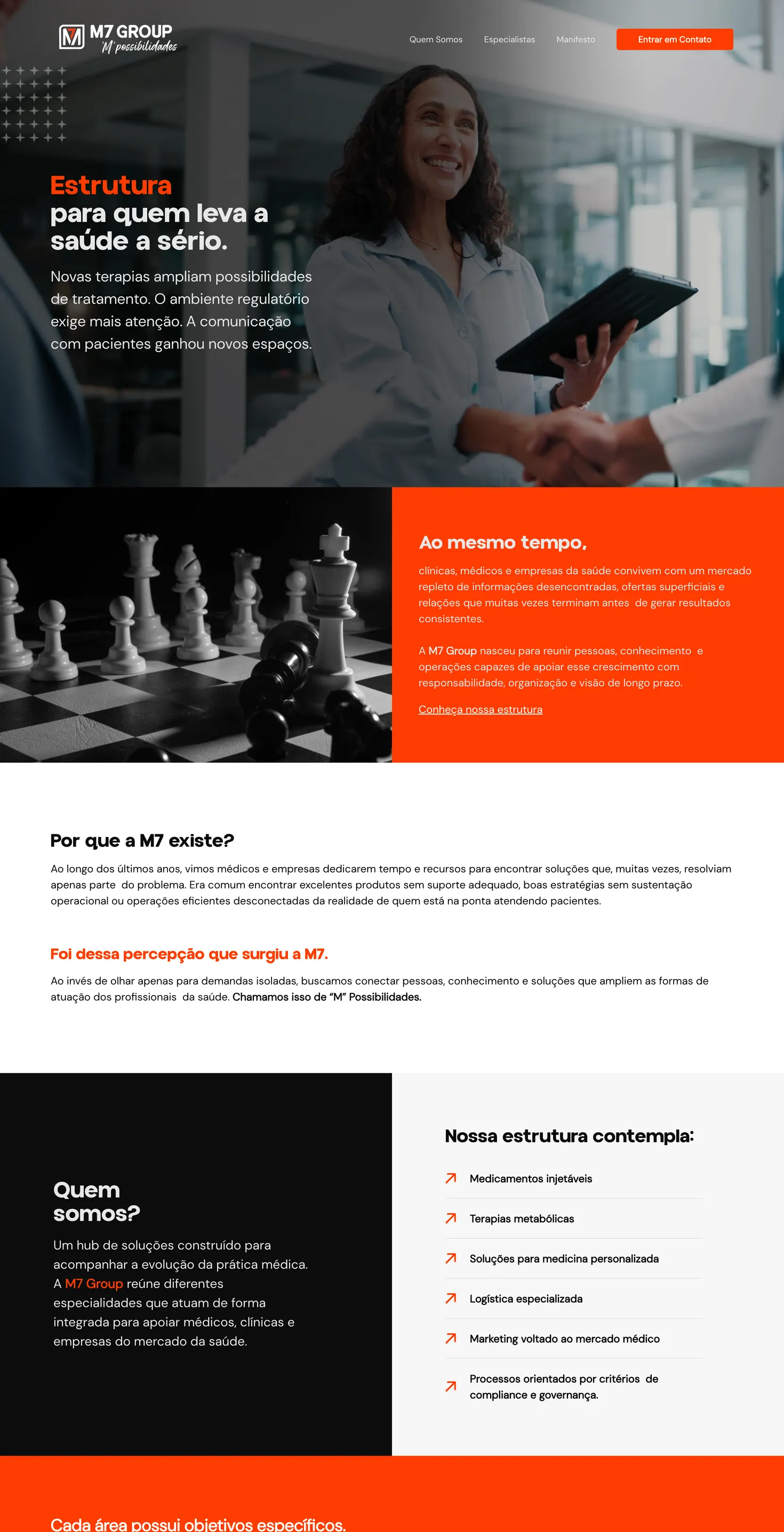
The site was built around the question any doctor or manager asks in the first thirty seconds: what exactly does M7 do, and why does it exist. The cover answers it in the headline, and the rest of the page fills in the detail.

Web design in a regulated market: how to explain a healthcare hub

“Solutions hub” is an abstract phrase, and healthcare is a market where trust comes before everything, with regulators, compliance and traceability in the middle of the conversation. A pretty, vague site does not solve that: whoever arrives needs to see what concretely exists, who the people behind it are and how to start.

There was a visual risk too: almost every healthcare site picks the same hospital blue and the same photo of a smiling doctor. Looking like everyone else is the fastest way to be remembered by no one.

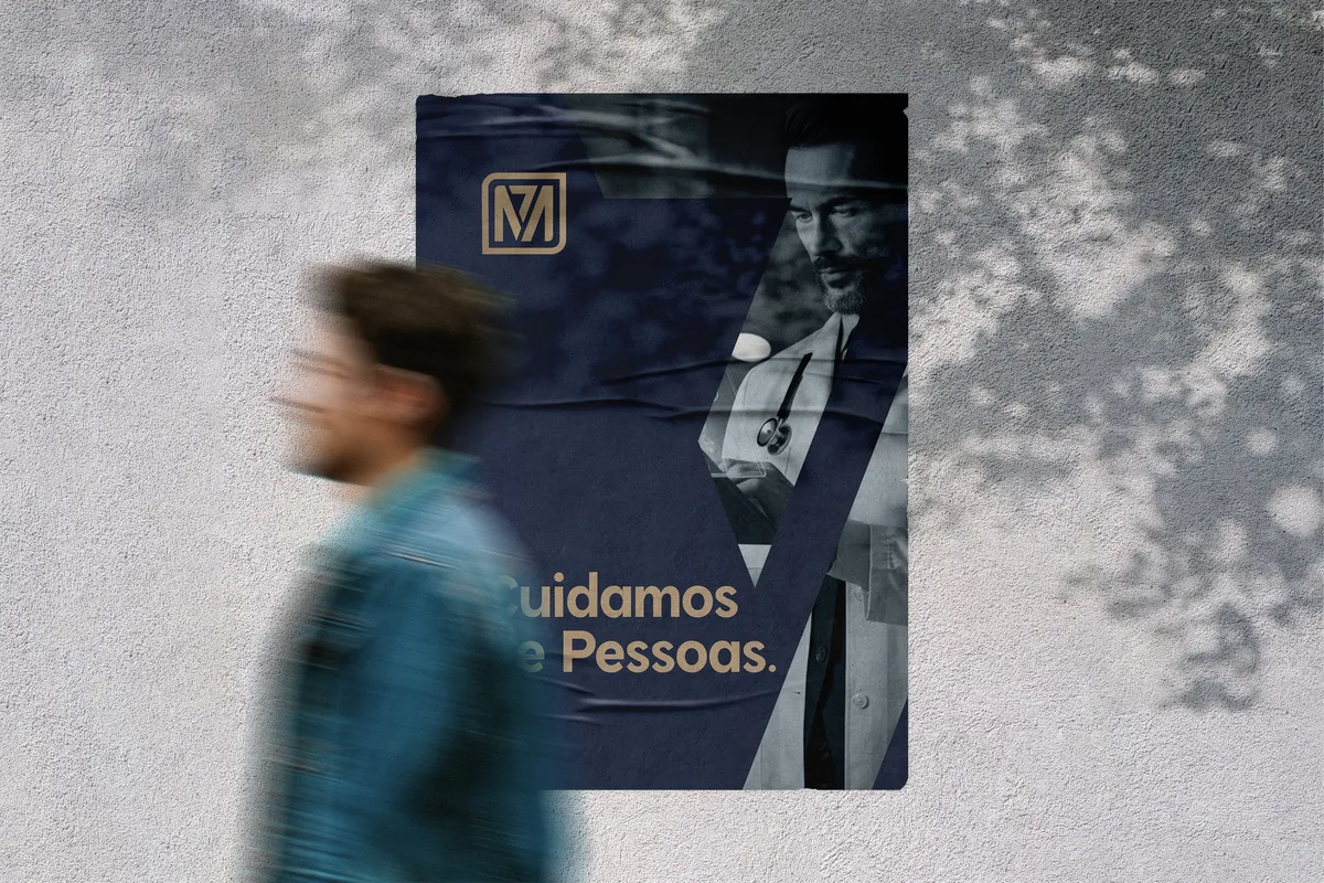
From the visual identity on the wall to the M7 site going live

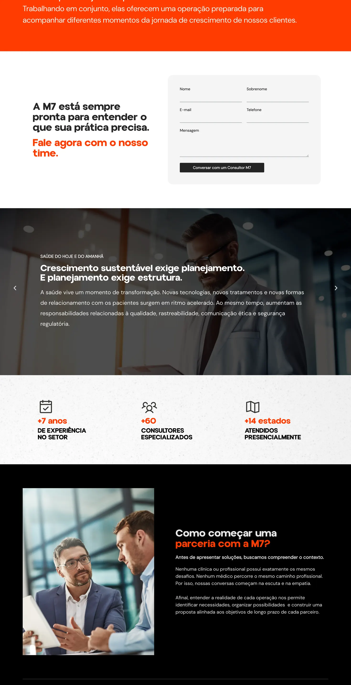
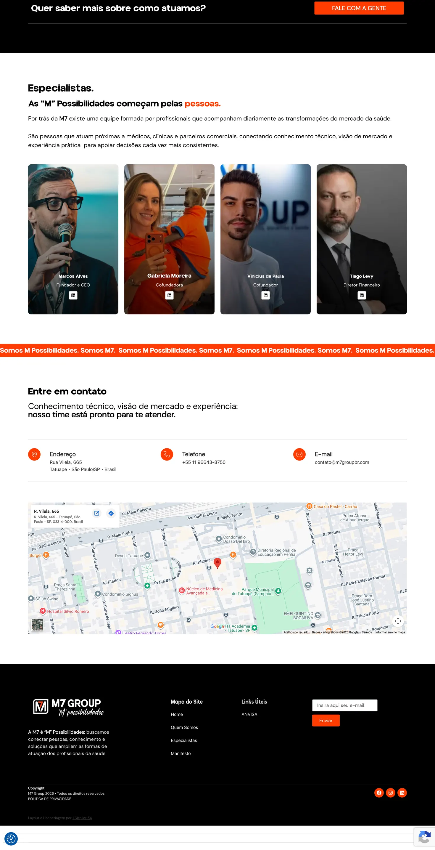
The published site carries M7’s manifesto, the six fronts of the structure listed one by one, the numbers behind the operation (7+ years of experience, 60+ specialised consultants, 14 states served in person), the Specialists section with the four partners, the Tatuapé address with a map, and a form that opens a direct conversation with a consultant.

L’Atelier 54 still handles development and hosting, and the credit sits in M7’s own footer. It is the same care we put into any project of visual identity and web design for healthcare companies.

M7 Group website designed by L’Atelier 54: part 1 of 3 of the home page
M7 Group website designed by L’Atelier 54: part 2 of 3 of the home page
M7 Group website designed by L’Atelier 54: part 3 of 3 of the home page

In the client’s own words

Visual identity and websites for healthcare companies.

I want a brand like this A four-step quote, with no meeting needed to start.
Video testimonial on the way
Vinicius de Paula · Co-founder, M7 Group
Client
M7 Group
Year
2025
Sector
Healthcare solutions hub
Where
Tatuapé, São Paulo (serving 14 states in person)
Deliverables
Visual identity, web design, launch and hosting