INVÉSTIA CAPITAL

Visual identity and web design · Financial services company · With DUA Marketing2025

Invéstia Capital brings five fronts of the financial market under one roof: credit, investments, consortium plans, insurance and pensions. It was founded on the experience of partners with more than 50 years in the market between them, and serves clients from São Paulo, Santos, Barueri and Uberlândia, with solutions available across Brazil.

L’Atelier 54 designed the company’s visual identity and website together with DUA Marketing. Every visual identity for a financial company faces the same challenge: to look solid in the first second without looking like a bank, and without losing the close, personal service that makes people leave their bank for an advisory firm.

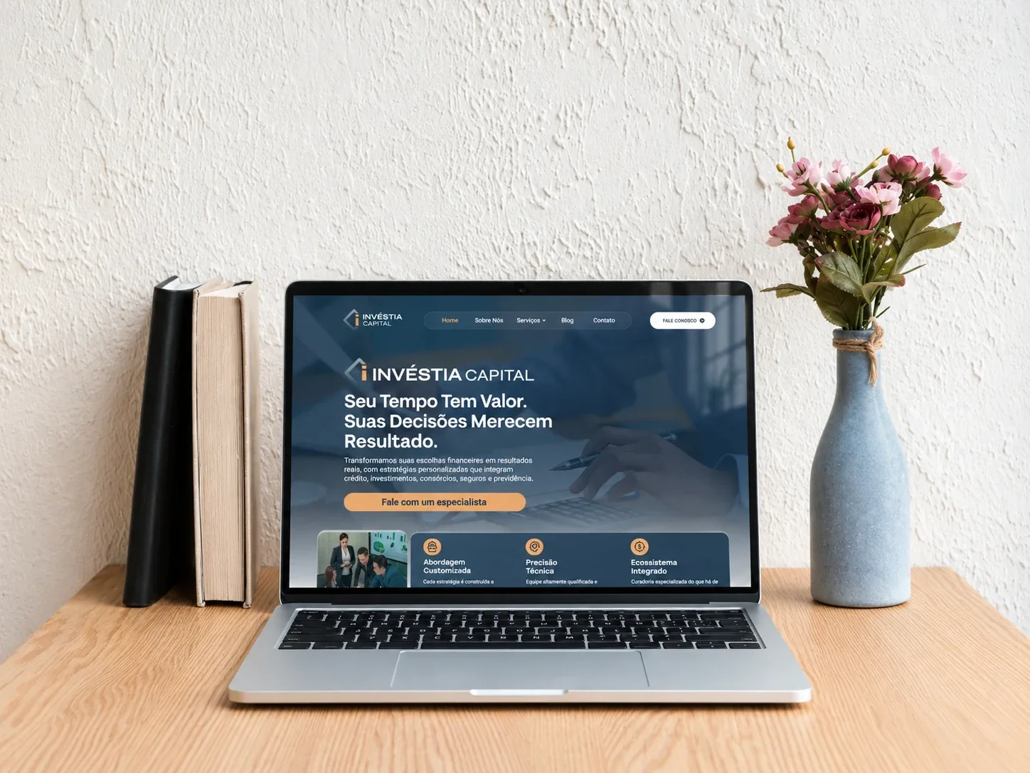
The Invéstia Capital website open on a laptop on a wooden table, between books and a vase of flowers, showing the line “Seu tempo tem valor. Suas decisões merecem resultado.”

The visual identity

Visual identity for a financial company: solid, but not a bank

The pieces of the system, one by one, from the symbol on its own to the brand on a façade.

Symbol

The icon

1/3

A diamond left open on one side, with the “i” of Invéstia in caramel filling the gap. The diamond is the shape of a cut stone, of value kept safe; the opening is an invitation to step in. The stroke carries a blue-grey gradient that adds depth with no effects needed. On its own, the icon covers the avatar, the favicon and the seal that separates one section of the website from the next.

Full lockup

The logo

2/3

INVÉSTIA is set in capitals, in a wide, firm typeface, with CAPITAL lighter underneath. The palette is deep navy, blue-grey and caramel: the blue the financial market already reads as trust, warmed by caramel so it never feels cold or bank-like. The brand comes in stacked and horizontal versions, so it fits both the top of the website and a sign.

Application

The brand on a façade

3/3

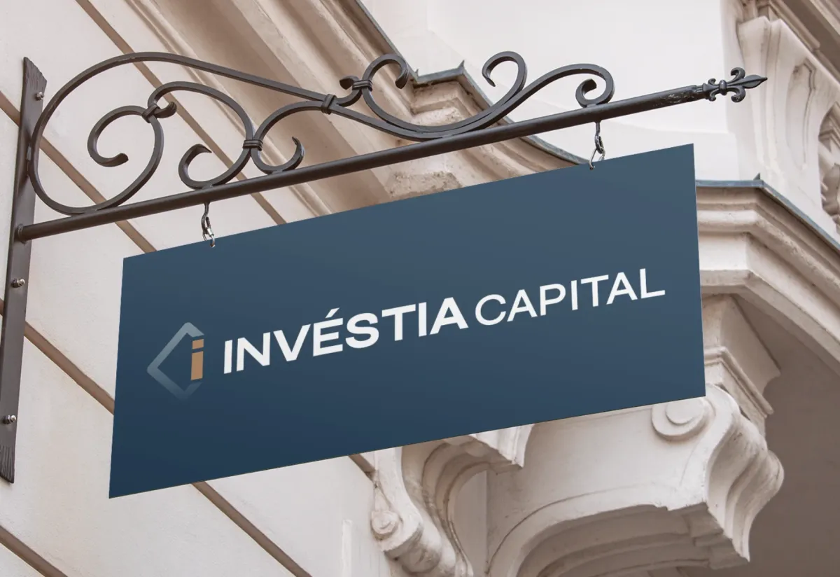
An iron hanging sign on an old façade shows what the visual identity had to prove: that the brand holds up away from the screen, at large size, next to classical architecture. For a firm that looks after other people’s wealth, looking established from day one isn’t vanity. It is what gets the first call answered.

Web design for an investment firm: the promise above the fold

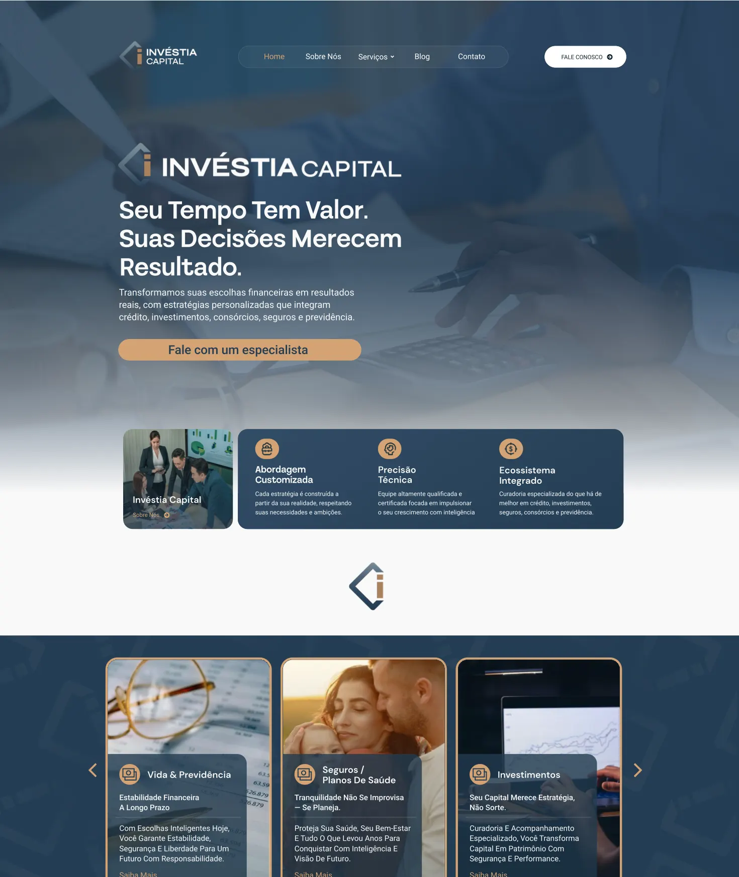
The site opens with the brand at full size over a blue-toned photo and the line that sums Invéstia up: “Your time has value. Your decisions deserve results.” Below it, one sentence says what the company does, naming all five products, and there is a single button: Talk to a specialist. Visitors understand in five seconds what the company is and what to do next.

Next come three strengths beside a photo of the team: a tailored approach, technical precision and an integrated ecosystem. On a website for a financial advisory firm, trust comes before the product, so it shows up first. The brand icon, on its own, opens the following section.

A financial advisory website with five products that doesn’t read like a bank catalogue

Credit, investments, consortium plans, insurance and pensions are five different conversations, each with its own client. Putting them on one page without becoming a bank’s cluttered shop window was the challenge of the site.

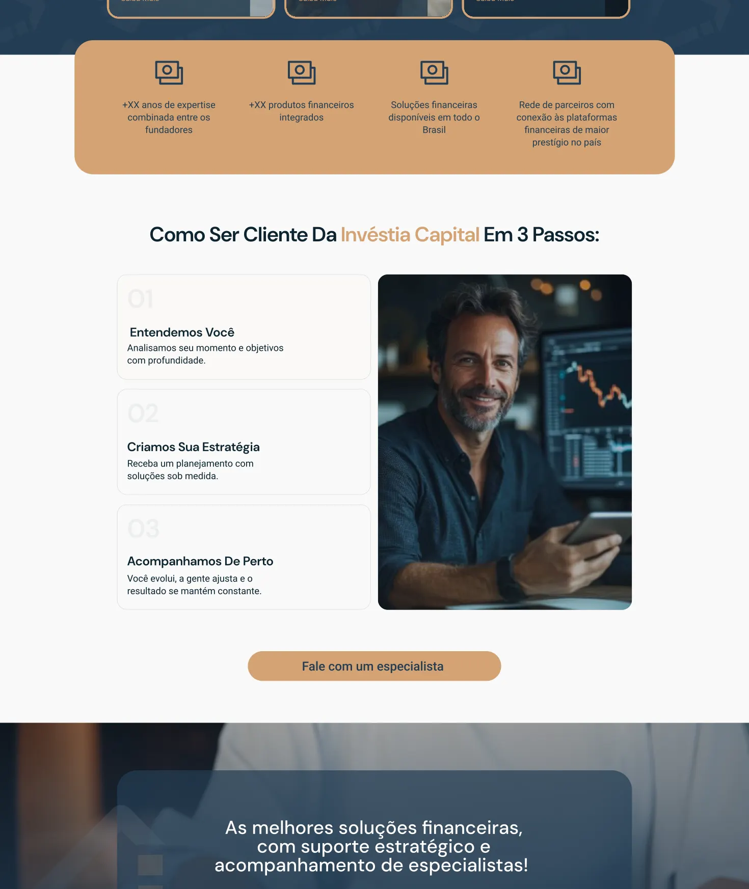
The answer was a carousel on a navy band, one card per product, each with a photo, an icon and a short promise: “Your capital deserves strategy, not luck.”, “Peace of mind isn’t improvised, it’s planned.” Then a caramel band with the company’s numbers and the path to becoming a client in three steps: we understand you, we build your strategy, we stay close.

From first click to specialist: a website that qualifies every request

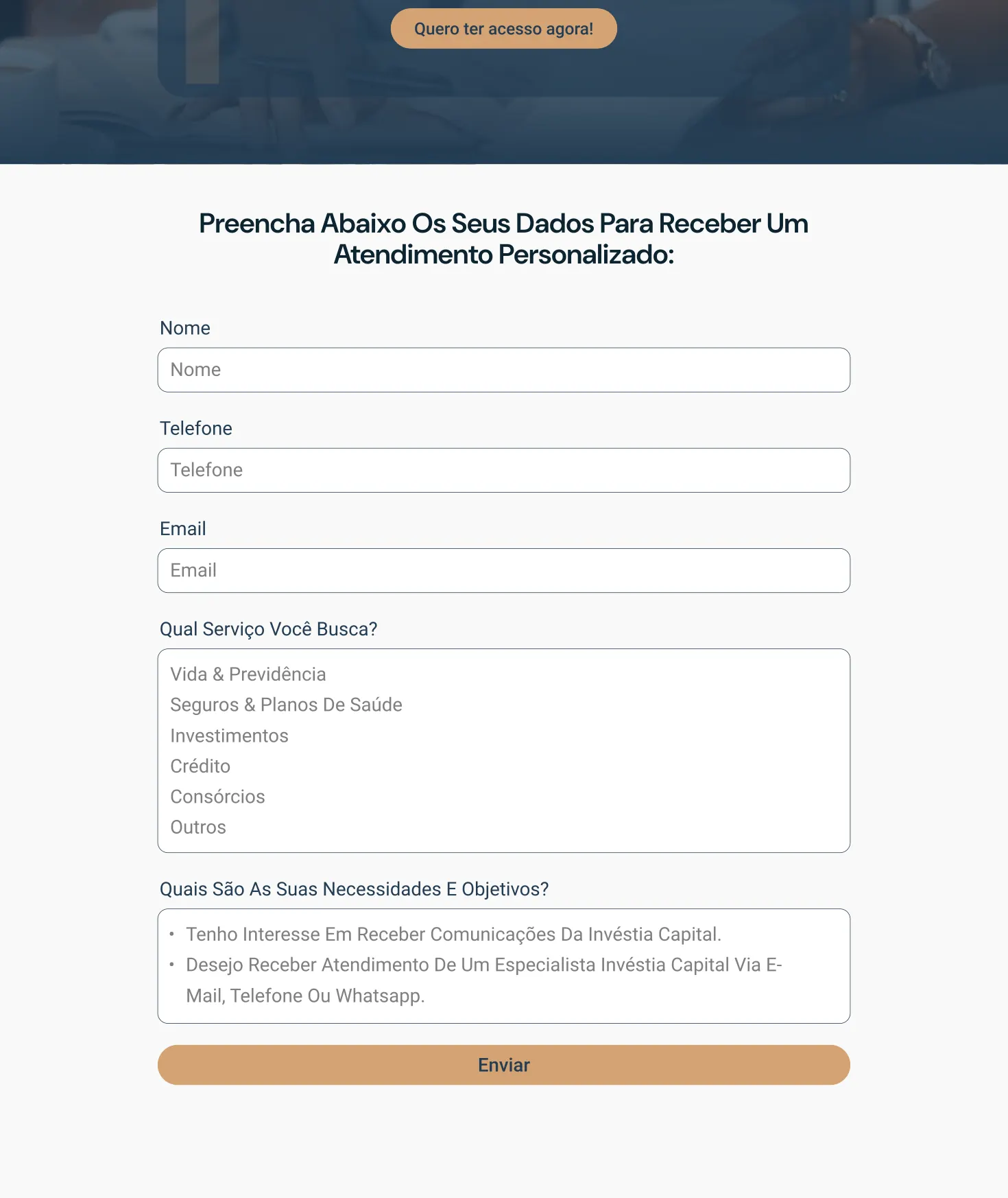
Before the form, a dark card over a photo repeats the promise: the best financial solutions, with strategic support and specialists by your side. The form asks which service the person is after and what their goals are, with separate contact consents, as Brazil’s data protection law (LGPD) requires. Requests reach the right specialist from the start.

Each product has its own page in the services menu, plus the blog and an About page. It is the groundwork for Invéstia to show up on Google for each of its five services, and it makes a solid model of a website for an insurance and consortium broker that also handles investments.

Web design for an investment firm: the Invéstia Capital website built by L’Atelier 54, part 1 of 3 of the home page
Web design for an investment firm: the Invéstia Capital website built by L’Atelier 54, part 2 of 3 of the home page
Web design for an investment firm: the Invéstia Capital website built by L’Atelier 54, part 3 of 3 of the home page

How the project came together

Trust can be designed.

Invéstia Capital’s visual identity and website were designed by L’Atelier 54 together with DUA Marketing, an agency based in Bali. A brand for the Brazilian financial market, designed by a team on two continents.

I want a brand like this A four-step quote, with no meeting needed to start.
  1. Visual identity and website

    L’Atelier 54

    Brazil

  2. Partner agency

    DUA Marketing

    Bali, Indonesia

  3. Client

    Invéstia Capital

    São Paulo, Santos, Barueri and Uberlândia

Visual identity and website for a financial services company
Client
Invéstia Capital
Year
2025
Sector
Financial services: credit, investments, consortium plans, insurance and pensions
Partnership
DUA Marketing, of Bali, Indonesia
Deliverables
Visual identity and web design